create password generator project with javascript.
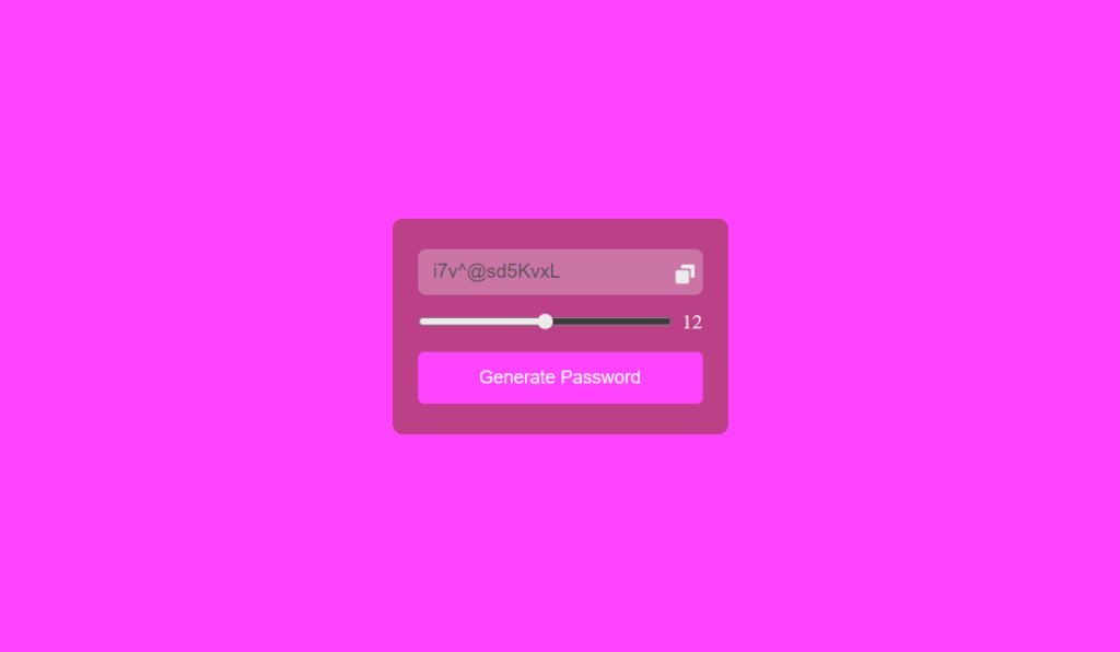
learn how to create a password generator project with HTML CSS JavaScript.
- Use HTML to Structure the Password generator project.
- Use CSS to Style the Password generator.
- Use JavaScript to make the password generator dynamic.
Source code of HTML file.
<!DOCTYPE html>
<html lang="en">
<head>
    <meta charset="UTF-8">
    <meta name="viewport" content="width=device-width, initial-scale=1.0">
    <title>Random Password Generator</title>
    <link rel="stylesheet" href="Style.css">
    <link href='https://unpkg.com/boxicons@2.1.4/css/boxicons.min.css' rel='stylesheet'>
    <script src="javascript.js" defer></script>
</head>
<body>
    <div class="container">
        <div class="wrapper">
            <div class="password-box">
                <input type="text" disabled>
                <i class='bx bxs-copy'></i>
            </div>

            <div class="range-box">
                <input type="range" min="6" max="18" value="8">
                <span class="slider-number">8</span>
            </div>
            <button class="generate-number">
                Generate Password
            </button>
        </div>
    </div>
</body>
</html>
Save this file with .html extension.
Explanation.
Body Section:
<div class=”container”>: This creates a main container element likely styled using the “container” class in the external CSS file.
<div class=”wrapper”>: This creates another container element likely styled using the “wrapper” class. This might be used for layout purposes.
<div class=”password-box”>: This creates a container element likely styled using the “password-box” class. This seems to be the section where the generated password will be displayed.
<input type=”text” disabled>: This creates an input field where the user can see the generated password. The disabled attribute prevents the user from modifying the text in this field.
<i class=’bx bxs-copy’></i>: This creates an icon element likely styled using the “boxicons” library classes “bx” and “bxs-copy”. This might represent a “copy” icon for copying the generated password. (Note: The actual icon display depends on the box icons library).
<div class=”range-box”>: This creates a container element likely styled using the “range-box” class. This seems to be the section for setting the password length.
<input type=”range” min=”6″ max=”18″ value=”8″>: It is used to create a range input element that permits the user to select a password length between 6 and 18 characters. The current value is about 8.
<span class=”slider-number”>8</span>: This creates a span element likely styled using the “slider-number” class. It displays the current chosen password length (which is 8 in this case).
<button class=”generate-number”>Generate Password</button>: This creates a button element likely styled using the “generate-number” class. Clicking this button likely triggers functionality to generate a random password based on the chosen length.
Source code of CSS file.
*
{
margin: 0;
padding: 0;
box-sizing: border-box;
}

:root
{
--first-bg-color:#ff44ff;
--second-bg-color:#bb4088;
--first-text-color:#ebebeb;
--second-text-color:#cacaca;
}

.container
{
min-height: 100vh;
width: 100%;
display: flex;
align-items: center;
justify-content: center;
background: var(--first-bg-color);
}

.wrapper
{
position: relative;
max-width: 330px;
width: 100%;
background: var(--second-bg-color);
border-radius: 10px;
padding: 30px 25px;
}

.wrapper .password-box
{
position: relative;
height: 45px;
margin-bottom: 15px;
border-radius: 6px;
}

.password-box input
{
height: 100%;
width: 100%;
font-size: 19px;
padding: 0 20px 0 15px;
border-radius: 8px;
border: none;
}

::placeholder
{
color: var(--first-text-color);
}

.password-box i
{
position: absolute;
top: 13px;
right:6px;
font-size: 22px;
cursor: pointer;
color: var(--first-text-color);
transition: all 0.5s ease;
}

.password-box i:hover
{
transform: scale(1.2);
color: var(--second-text-color);
}

.range-box
{
display: flex;
align-items: center;
}

.range-box input
{
width: 100%;
height: 8px;
accent-color: var(--first-text-color);
}

.range-box .slider-number
{
min-width: 30px;
text-align: right;
font-size: 20px;
color: var(--first-text-color);
}

.generate-number
{
width: 100%;
margin-top: 18px;
padding: 15px ;
font-size: 18px;
color: var(--first-text-color);
background: var(--first-bg-color);
border-radius: 6px;
cursor: pointer;
border: none;
transition: all .7s ease;
}

.generate-number:hover
{
color: var(--second-text-color);
transform: scale(1.1);
}
Save this code as style.css
Explanations.
1. Global Styles:
* selector: This selects all elements on the webpage.
margin: 0; This removes any default margins from all elements.
padding: 0; This removes any default padding from all elements.
box-sizing: border-box; This ensures the element’s size is calculated based on its width/height and includes padding and border within those dimensions.
2. Custom Properties:
:root selector: This defines custom properties (variables) accessible throughout the stylesheet.
–first-bg-color:#ff44ff: Defines a custom property named –first-bg-color with a value of pink (#ff44ff). This likely represents the background color for the main container.
Similar properties are defined for –second-bg-color, –first-text-color, and –second-text-color which are likely used for different background and text colors throughout the design.
3. Container Styles:
.container selector: This targets elements with the class “container”.
display: flex; sets the display of the box to flexbox, making an allowance for flexible alignment of child elements.
align-gadgets: center; Aligns the content material of the field vertically inside the center.
justify-content: middle; Aligns the content material of the container horizontally inside the center.
background: var(–first-bg-color); sets the heritage color of the box using the formerly defined custom property –first-bg-color.
4. Wrapper Styles:
.wrapper selector: This targets elements with the class “wrapper”. This likely represents the inner box where the password generation elements reside.
position: relative; Enables relative positioning for child elements within the wrapper.
max-width: 330px; Sets a maximum width for the wrapper element.
width: 100%; guarantees the wrapper fills the to-be-had horizontal area in the container.
background: var(–second-bg-colour); sets the heritage colour the use of the –second-bg-color custom property.
border-radius: 10px; provides rounded corners to the wrapper element.
padding: 30px 25px; provides padding to the top, bottom, left, and right aspects of the wrapper.
5. Password Box Styles:
.wrapper .password-box selector: This targets elements with the class “password-box” that are children of elements with the class “wrapper”. This likely represents the area displaying the generated password.
position: relative; Enables relative positioning for child elements within the password box.
height: 45px; Sets the height of the password box.
margin-bottom: 15px; Adds margin to the bottom of the password box.
border-radius: 6px; Add rounded corners to the password box.
6. Password Input Styles:
.password-box input selector: This targets the input element within the password box where the generated password is displayed.
Various styles are applied to configure the appearance of the input field, including font size, padding, border-radius, and disabling any border.
7. Placeholder Text Style:
::placeholder selector: This targets the placeholder text displayed within the input field before a password is generated.
color: var(–first-text-color); Sets the color of the placeholder text using the –first-text-color custom property.
8. Copy Icon Styles:
.password-box i selector: This targets icon elements with an inline tag (likely<i>) that are children of elements with the class “password-box”. This icon likely represents the “copy” functionality.
Various styles are applied to position the icon, define its size, color, and cursor behavior on hover, and implement a smooth transition effect.
9. Range Box Styles:
.range-box selector: This targets elements with the class “range-box”.
Source code of JavaScript file.
const passwordinput = document.querySelector(".password-box input"),
copyicon = document.querySelector(".password-box i"),
rangeinput = document.querySelector(".range-box Input"),
slidernumber = document.querySelector(".range-box .slider-number"),
generatenumber = document.querySelector(".generate-number");
let allCharacters ="abcdefghijklmnopqrstuvwxyzABCDEFGHIJKLMNOPQRSTUVWXYZ123456789@#$%^&*";
const generatepassword =() => {
    let newpassword="";
    for(let i=0 ; i < rangeinput.value ; i++){
        let randomnumbers = Math.floor(Math.random() * allCharacters.length);
        newpassword +=allCharacters[randomnumbers];
}
        passwordinput.value = newpassword;
};
rangeinput.addEventListener("input" , () => {
    slidernumber.innerText= rangeinput.value;
    copyicon.classList.replace("bxs-message-alt-check" , "bxs-copy")
}
);
copyicon.addEventListener("click" , () =>{
    navigator.clipboard.writeText(passwordinput.value);
    copyicon.classList.replace("bxs-copy","bxs-message-alt-check")
});
generatepassword();
generatenumber.addEventListener("click" , generatepassword );
Save this file with .js extension.
Explanations.
1. Selecting elements:
The code starts by selecting specific elements from the HTML document using querySelector. It stores references to them in variables for later use:
passwordinput: The input field where the generated password will be displayed.
copyicon: The icon element likely used for copying the password.
rangeinput: The range slider for determining the password length.
slidernumber: The span element displaying the current password length value.
generatenumber: The button that triggers password generation.
2. Defining a character pool:
let allCharacters = “abcdefghijklmnopqrstuvwxyzABCDEFGHIJKLMNOPQRSTUVWXYZ123456789@#$%^&*”;
This creates a string containing diverse characters to be used to randomly assemble the password.
3. Generating a password function:
const generatepassword = () => {…}
This defines a function responsible for generating and displaying a new password.
Inside the function:
let newpassword = “”; It initializes an empty string to hold the new password.
The for loop iterates through several times equal to the current value of rangeinput (the chosen password length):
let randomnumbers = Math.floor(Math.random() * allCharacters.length); It generates a random number within the range of the allCharacters string length.
newpassword += allCharacters[randomnumbers]; It appends a random character from the allCharacters string to the newpassword variable.
passwordinput.value = newpassword; It sets the generated password as the value of the password input field to display it to the user.
4. Handling range slider changes:
rangeinput.addEventListener(“input”, () => {…});
It adds an event listener to the range input element. It listens for changes in the slider’s value.
Inside the listener:
slidernumber.innerText = rangeinput.value; It updates the displayed number in the slidernumber element to reflect the current password length choice.
copyicon.classList.replace(“bxs-message-alt-check”, “bxs-copy”); It likely switches the icon class for visual feedback, indicating that the password is ready to be copied.
5. Handling copy icon clicks:
copyicon.addEventListener(“click”, () => {…});
It adds an event listener to the copy icon element. It listens for clicks on the icon.
Inside the listener:
navigator.clipboard.writeText(passwordinput.value); It copies the generated password to the user’s clipboard.
copyicon.classList.replace(“bxs-copy”, “bxs-message-alt-check”); It likely switches the icon class again to provide visual confirmation of successful coping.
6. Initiating password generation:
generatepassword(); It calls the generatepassword function once initially to display a password when the page first loads.
7. Responding to button clicks:
generatenumber.addEventListener(“click”, generatepassword);
It adds an event listener to the “Generate Password” button. When clicked, it calls the generatepassword function to create and display a new password based on the current slider value.
Thanks for reading this article