Digital Alarm clock with JAvaScript
Learn how to create a digital alarm clock with HTML CSS and Javascript.
- Use HTML to Structure a digital alarm clock.
- Use CSS to style the clock.
- For Functionality of Alarm Clock use Javascript.
Source code of HTML file
<!DOCTYPE html>
<html lang="en">
<head>
<meta charset="UTF-8">
<meta name="viewport" content="width=device-width, initial-scale=1.0">
<title>Alarm Clock</title>
<link rel="stylesheet" href="style.css">
<Script src="Alarm.js" defer></Script>
</head>
<body>
<div class="container">
<div class="wrapper">
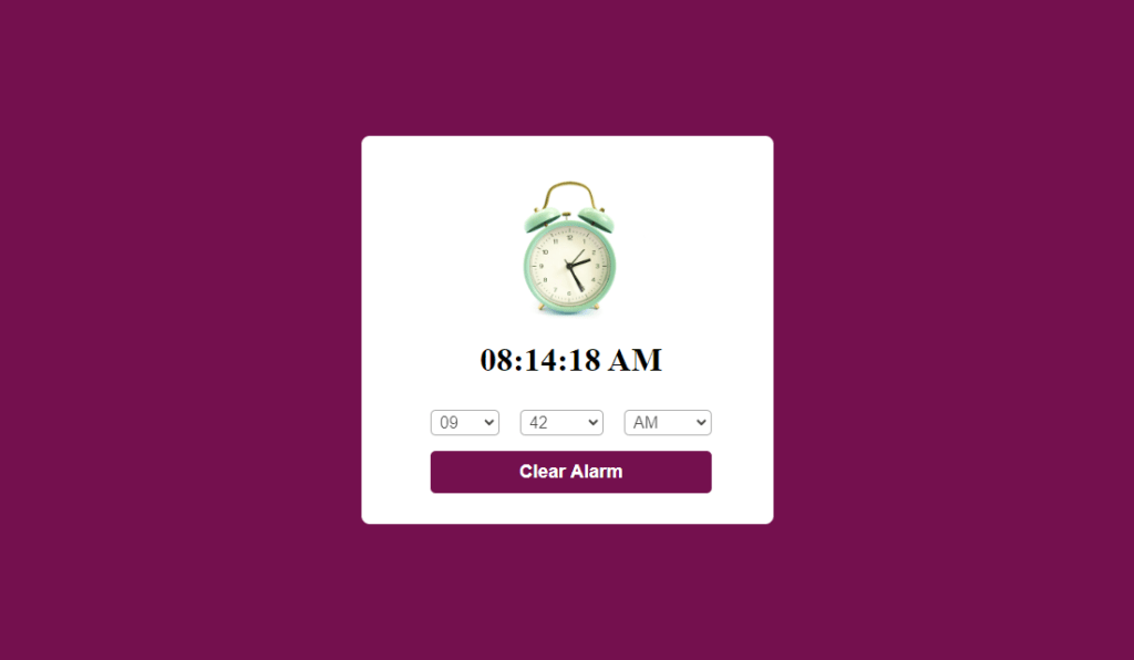
<img src="Alarm.jpg" >
<h1>05:00:00 AM</h1>
<div class="content">
<div class="column">
<select >
<option value="hours" selected hidden>Hour</option>
</select>
</div>
<div class="column">
<select >
<option value="Minutes" selected hidden>Minute</option>
</select>
</div>
<div class="column">
<select >
<option value="AM/PM" selected hidden>AM/PM</option>
</select>
</div>
</div>
<button>Set Alarm</button>
</div>
</div>
</body>
</html>
Explanation
Body Section (<body>):
- Container (<div class=”container”>): Creates a container element to group and organize the content. This element likely has styles applied from “style.css” to control its positioning or layout.
- Wrapper (<div class=”wrapper”>): Another container element within the main container, potentially used for additional layout or styling purposes.
- Image (<img src=”Alarm.jpg”>): Displays an image named “Alarm.jpg” likely representing a visual of an alarm clock.
- Current Time (<h1>05:00:00 AM</h1>): Displays a heading (h1) element with the initial time “05:00:00 AM.” This will likely be replaced with the user’s selected alarm time.
- Content (<div class=”content”>): Another container element, probably used to arrange the clock selection controls.
- Columns (<div class=”column”>): Three columns are created, each likely styled in “style.css” to arrange the dropdown menus horizontally.
- Select Controls (<select>): Three dropdown menus are created using the select element. These will presumably allow the user to set hours, minutes, and AM/PM for the alarm time.
- Placeholder Options (<option value=” hours” selected hidden>Hour</option>): Each dropdown menu has an initial option that displays “Hour,” “Minute,” or “AM/PM” but is disabled (hidden) and has no actual value (value=”hours”). These serve as placeholders until the user selects a valid time.
- Set Alarm Button (<button>Set Alarm</button>): A button element is created to trigger the alarm setting functionality when clicked. This behavior will likely be implemented in the “Alarm.js” script.
Source code of CSS file
*{
    margin: 0;
    padding: 0;
    box-sizing: border-box;
}
.container{
    width: 100%;
    height: 100vh;
    display: flex;
    align-items: center;
    justify-content: center;
    background: #74104e;
}
.wrapper{
    width: 400px;
    background: #fff;
    padding: 30px 30px 30px 38px;
    display: flex;
    align-items: center;
    justify-content: center;
    flex-direction: column;
    border-radius: 8px;
}
.wrapper img{
    max-width: 300px;
}
.wrapper .content{
    width: 100%;
    margin-top: 30px;
    display: flex;
    align-items: center;
    justify-content: center;
}
.wrapper .content.disable{
    opacity: 0.7;
    pointer-events: none;
}
.wrapper .content select{
    font-size: 16px;
    padding: 2px 4px;
    margin: 0 10px;
    border: 1px solid #888888;
    border-radius: 5px;
}
.wrapper button{
    width: 82%;
    margin-top: 15px;
    padding: 10px 0;
    font-size: 18px;
    font-weight: 600;
    outline: none;
    border: none;
    border-radius: 5px;
    background: #74104e;
    color: #fff;
}
Explanation
Imagine this webpage as a stage for your alarm clock. The CSS code acts as the stage manager, meticulously arranging the set pieces and actors (HTML elements) to create a visually captivating performance.
Setting the Stage:
- The * selector is like a universal backstage crew, ensuring all elements start with zero margins and padding, creating a clean slate. It also sets the “box-sizing” property to a specific mode, making element-sizing calculations more predictable.
The Grand Container:
- The .container class is the mighty stage itself. It stretches grandly to fill the entire visible area of the browser window (100% width and height), making the most of the available space. It also employs a clever trick called “flexbox” allowing for flexible positioning of the content within. Think of it as a stage that can adapt to different screen sizes. To create a dramatic atmosphere, the stage is bathed in a deep purple (#74104e) background.
The Clock Tower:
- The .wrapper class represents the clock tower, a central white structure (background: #fff) housing the clock face and controls. It has a width of 400 pixels, ensuring it’s not too large or small. Padding is strategically applied (30px on most sides, 38px on the right) to create a balanced look, potentially accommodating the alarm image. Flexbox is again employed within the tower, arranging elements in a neat column (flex-direction: column). The tower boasts a touch of elegance with rounded corners (border-radius: 8px).
- The .wrapper img selector focuses on the alarm image within the tower. It acts like a spotlight, ensuring the image doesn’t overflow its designated space by setting a maximum width of 300 pixels.
The Clock Face and Controls:
- The .wrapper .content class targets the clock face area where the user interacts with the time selection. It stretches across the entire width of the tower (100%) and is positioned below the image with a 30px margin (margin-top: 30px) for better visual separation. Flexbox takes center stage again, ensuring the selection elements are neatly centered both horizontally and vertically.
- A potential hidden feature is revealed by the .wrapper .content.disable selector. It seems like a stagehand might dim the clock face (opacity: 0.7) and disable user interaction (pointer-events: none) when an alarm is set, preventing accidental changes.
- The .wrapper .content select selector targets the individual dropdown menus, the heart of the time selection process. Each menu boasts a clear and readable font size of 16 pixels. Padding (2px 4px) and margins (0 10px) create a comfortable space for the user to interact with them. A light gray border (1px solid #888888) defines the menu’s outline, and rounded corners (border-radius: 5px) add a touch of polish.
The Alarm Button:
- The .wrapper button selector shines a spotlight on the critical alarm button. It occupies a prominent space, taking up 82% of the tower’s width, with some breathing room on either side (margin-top: 15px). The button itself is styled with a bold presence. A generous padding of 10px on the top and bottom provides ample space for the button text. The font size is increased to 18 pixels for better readability, and a weight of 600 makes the text appear bolder. The button boasts a sleek and stylish look with a deep purple background (#74104e) matching the container and crisp white text (#fff) for maximum contrast. There are no outlines or borders to distract from its clean design, and rounded corners (border-radius: 5px) add a touch of sophistication.
Source code of JavaScript
const currentTime = document.querySelector("h1"),
content = document.querySelector(".content"),
selectMenu = document.querySelectorAll("select"),
setAlarmBtn = document.querySelector("button");
let alarmTime = null, isAlarmSet = false,
ringtone = new Audio("ringtone.mp3");
for(let i = 1; i < 13; i++){
    i = i < 10 ? "0" + i : i;
    let option = `<option value="${i}">${i}</option>`;
    selectMenu[0].firstElementChild.insertAdjacentHTML("afterend" , option);
}
for(let i = 0; i < 60; i++){
    i = i < 10 ? "0" + i : i;
    let option = `<option value="${i}">${i}</option>`;
    selectMenu[1].firstElementChild.insertAdjacentHTML("afterend" , option);
}
for(let i = 0; i < 2; i++){
    let ampm = i == 0 ? "AM" : "PM"
    let option = `<option value="${ampm}">${ampm}</option>`;
    selectMenu[2].firstElementChild.insertAdjacentHTML("afterend" , option);
}
setInterval(()=>{
    let date = new Date(),
    h = date.getHours(),
    m = date.getMinutes(),
    s = date.getSeconds(),
    ampm = "AM";
    if (h > 12) {
        h = h - 12 ;
        ampm = "PM";
    }
    h = h == 0 ? h = 12 : h ;
    h = h < 10 ? "0" + h : h ;
    m = m < 10 ? "0" + m : m ;
    s = s < 10 ? "0" + s : s ;
    currentTime.innerText = `${h}:${m}:${s} ${ampm}`;
    if(alarmTime == `${h}:${m} ${ampm}`)
    {
        ringtone.play();
        ringtone.loop = true;
    }
},1000);
function alarm(){
        if(isAlarmSet){
            alarmTime="",
            ringtone.pause();
            content.classList.remove("disable");
            setAlarmBtn.innerText = "Set Alarm";
            return isAlarmSet = false;
        }
        let time = `${selectMenu[0].value}:${selectMenu[1].value} ${selectMenu[2].value}`;
        if(time.includes("hours") || time.includes("Minutes") || time.includes("AM/PM"))
        {
            return alert("please select a valid time");
        }
        isAlarmSet = true;
        alarmTime = time;
        content.classList.add("disable");
        setAlarmBtn.innerText = "Clear Alarm";
}
setAlarmBtn.addEventListener("click",alarm);
Explanation
Setting the Stage:
- The code acts as the stage manager, meticulously arranging the elements:
- The <h1> element becomes the prominent clock face, displaying the current time in bold letters (currentTime).
- The element with the class “.content” transforms into the control panel (content), housing the dropdown menus for setting the alarm time.
- All select elements (dropdown menus) become actors, ready to be dressed with time options (selectMenu). They’ll be positioned strategically on the control panel.
- The button element becomes the control switch (setAlarmBtn), labeled “Set Alarm” initially, waiting for user interaction.
Props and Costumes:
- The code prepares the props for the time selection:
- It creates numerous neatly formatted time options for hours, minutes, and AM/PM, like costumes for the actors (dropdown menus). It ensures single-digit times have leading zeros for a polished look.
- These options are then strategically placed within the dropdown menus, ready for the user to choose (insertAdjacentHTML).
The Clock’s Performance:
- The code sets up a continuous loop, like an ever-ticking metronome:
- Every second, it retrieves the current date and time using a Date object, like a backstage clock prompting the actors (dropdown menus) for their positions.
- It extracts the hours, minutes, and seconds, akin to the actors moving their hands on the clock face.
- It handles AM/PM conversion, ensuring a smooth transition between day and night scenes.
- The extracted time is then meticulously formatted with leading zeros for a polished clock face display (currentTime.innerText).
- The code constantly checks if the formatted current time matches a pre-set alarm time (alarmTime).
The Alarm Sounds:
- If the current time matches the pre-set alarm time (alarmTime):
- The code acts like a sound technician, playing the “ringtone.mp3” audio, and simulating the alarm sound. The ringtone is set to loop (ringtone.loop = true) to create a continuous alarm.
The Control Switch:
- The “Set Alarm” button awaits user interaction:
- When clicked, it triggers the alarm function, like a stagehand responding to the user’s command.
- The alarm function checks if an alarm is currently set (isAlarmSet).
- If yes, it acts like a stage manager silencing the alarm:
- It clears the pre-set alarm time (alarmTime).
- It pauses the ringtone (ringtone.pause()).
- It reactivates the control panel (content) for user interaction by removing the “disable” class.
- It resets the button text back to “Set Alarm” for the next alarm setting.
- If no alarm is set, it initiates the alarm setup:
- It gathers the user’s chosen time from the dropdown menus, constructing a new alarm time string.
- It performs a quick check to ensure valid time selection and alerts the user if necessary (e.g., placeholder options selected).
- If the time is valid, it sets the pre-set alarm time (alarmTime).
- It disables the control panel (content) to prevent accidental changes during an active alarm.
- It transforms the button text to “Clear Alarm” indicating an active alarm.
Thanks for reading this Article.
Create a digital alarm clock with HTML CSS and Javascript.